

Parsel: Removing language barriers from design workflows
AI • PRODUCT DESIGN • ENTERPRISE UXParsel is an AI-assisted design comprehension tool built to help multilingual product teams understand, translate, and document interfaces regardless of the language they were originally created in.
Role
Lead designer
Focus
AI & Design Productivity
Built with
Claude
Year
2026
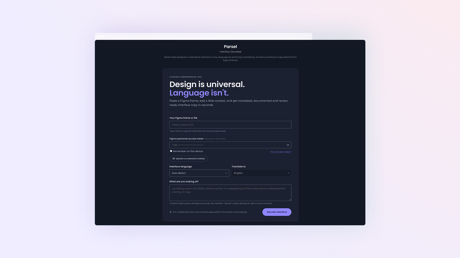
About The Project
From a translation problem to a design comprehension tool.
As a consultant working across markets, I regularly inherit Figma files in languages I don't read — years of decisions locked inside interfaces I can't evaluate until I understand what they actually say. Parsel started as a way to solve that specific problem for myself, then became an exploration of how an AI tool should behave when it isn't certain.
The concept centres on two parts of the same flow:
Decode Paste a Figma frame — or a screenshot, when Figma access isn't available — and get every string read, typed by UI element, and translated, with a confidence level attached to each one, never presented as more certain than it is.
Review A documentation-ready table linked directly to the interface preview. Hovering a row highlights the exact text it came from; nothing is marked "reviewed" until a person says so.
This wasn't a client engagement — it was a self-directed exploration of a real professional need, built through iterative collaboration with Claude, refining the product, the interaction design, and the visual identity over dozens of rounds.
The key question:
How might an AI tool help designers move faster through unfamiliar interfaces, without ever pretending to understand more than it does?
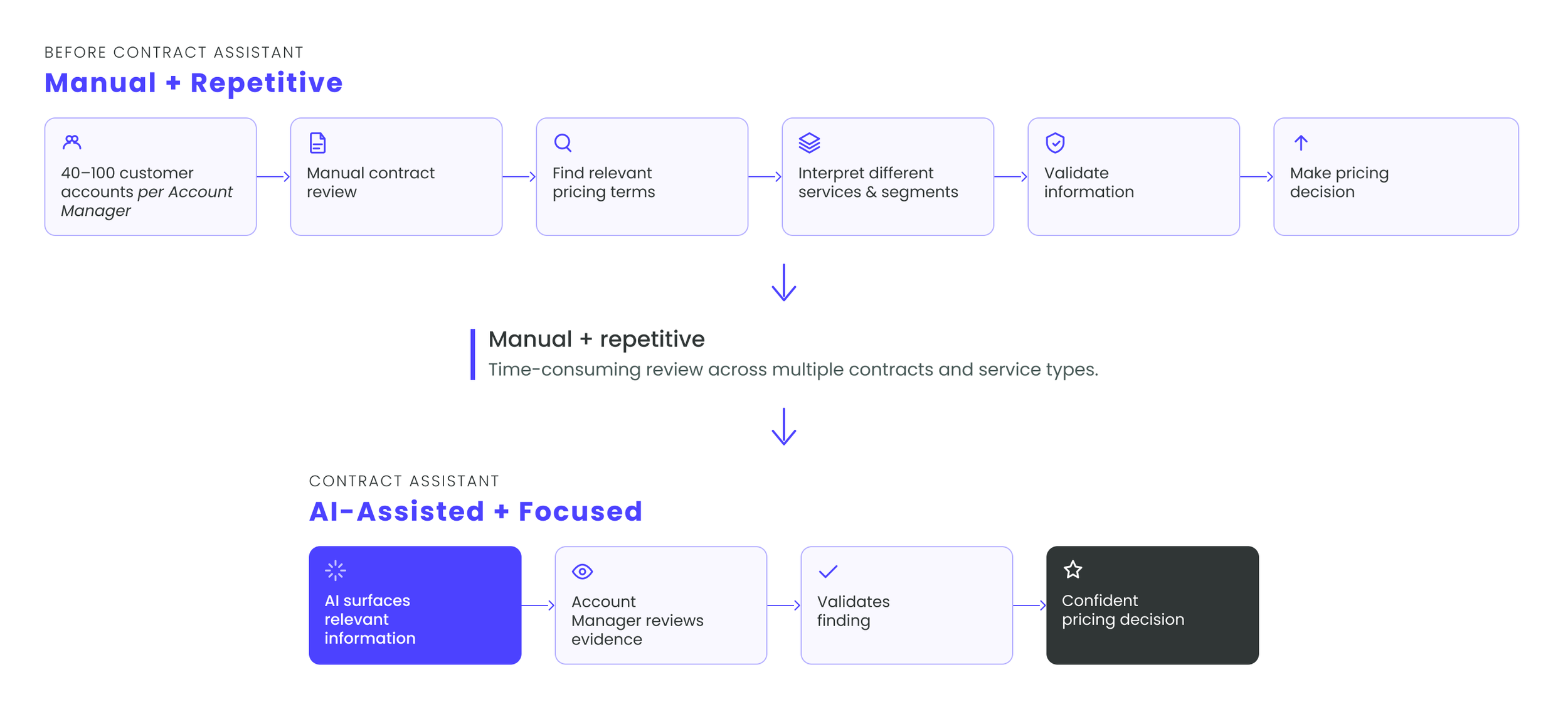
Workflow Impact: Collapsed a 6-step manual search process across 40–100 accounts into a streamlined 2-step review and validation workflow.
Designing Core System Behaviors
From contracts to actionable insights
The user experience was architected around two complementary interaction models designed to fit how Account Managers actually work:
01 Decode
Parsel reads every text layer in a Figma frame — or, when there's no Figma access, a plain screenshot — and returns each string typed by UI element, translated into English, and scored by confidence.
The experience integrates directly with Claude's multimodal reasoning, reading the interface image alongside the raw text layers pulled from Figma's own data, so positions and content stay grounded in the real file rather than guessed.
The challenge was resisting the urge to make the AI sound more certain than it is. Ambiguous product names, idioms, and legal wording needed to be flagged rather than confidently mistranslated.
Understanding the problem Early versions worked from screenshots alone, asking the AI to both read and place text. Moving to Figma's own layer data made positioning exact and freed the AI to focus purely on meaning.
Shaping the experience Translation confidence became a first-class part of the interface, not a technical footnote. High-confidence strings move straight to draft; ambiguous ones carry a note explaining exactly why.
Making it real Every prompt, fallback, and "not connected yet" message was tested against real constraints — including the platform's own sandboxing, which blocks live calls to Figma or Anthropic outside the chat itself.
02 Review
Every decoded string lands in a documentation-ready table — element type, original text, English draft, and status. Two things make it more than a static list.
Find it on screen, instantly. Hovering any row highlights the exact matching text in the interface preview — a soft yellow marker over the real screenshot, not a guess at where it might be. On a screen with 40+ strings, this is the difference between scanning a wall of text for five minutes and knowing, in half a second, exactly which button or label a row refers to.
Documentation, not just data. The same table copies straight into Confluence, Word, or Notion as a formatted table, or as Markdown for GitHub and dev tools — element type, original copy, English draft, and review status, all in one paste. It's built to hand off, not to be rebuilt as a second step after the design work is done.
Built as a single Figma-to-table pipeline, the review experience needed to hold up whether a screen had 12 strings or 55, and whether every translation was confident or half of them needed a second look.
The challenge was designing for three very different levels of certainty, without making any of them feel like a dead end.
High confidence, ready to review Most strings resolve cleanly. They're marked as drafts immediately, sit in the table with a plain-language English version, and are ready for a quick human check before use.
Uncertain, flagged for a reason Ambiguous product names, idioms, and context-dependent wording get a visible note explaining exactly what's unclear — never a silent guess dressed up as a translation.
No live connection yet Pasting a real Figma link is met with an honest message: this prototype can't reach Figma's API from inside its current environment. It says so plainly, rather than faking a result.
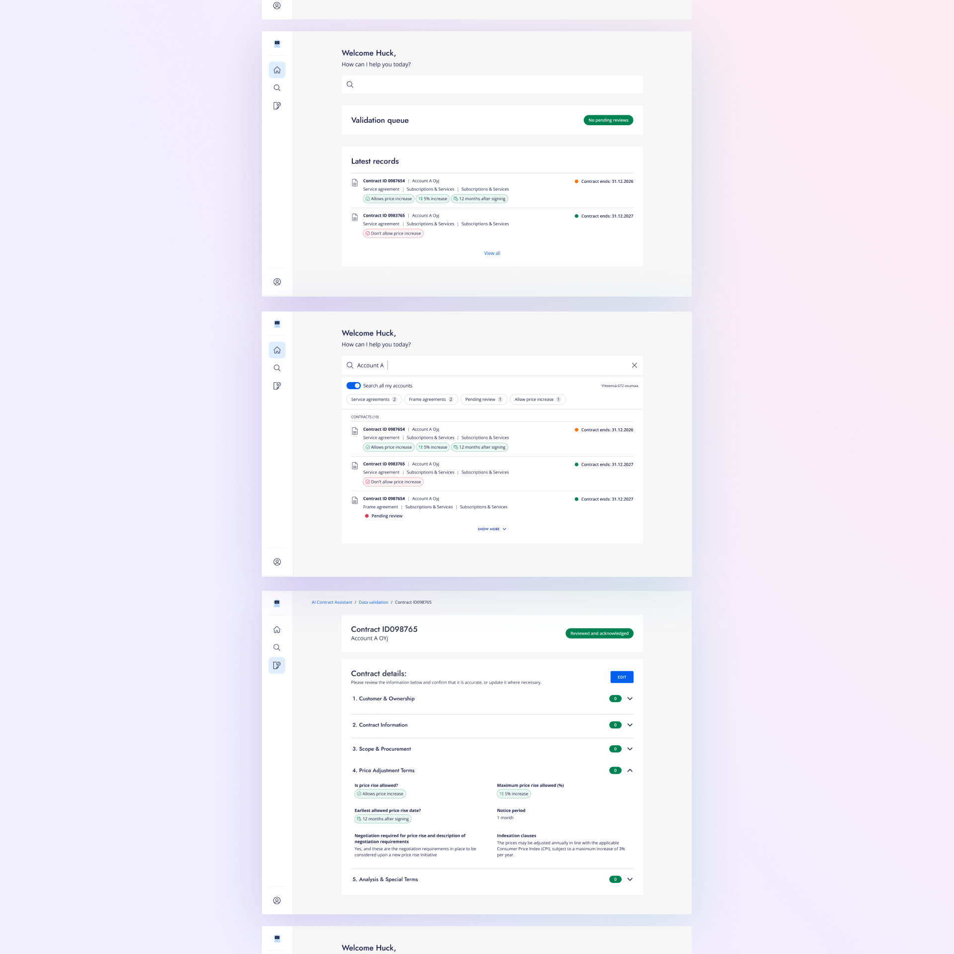
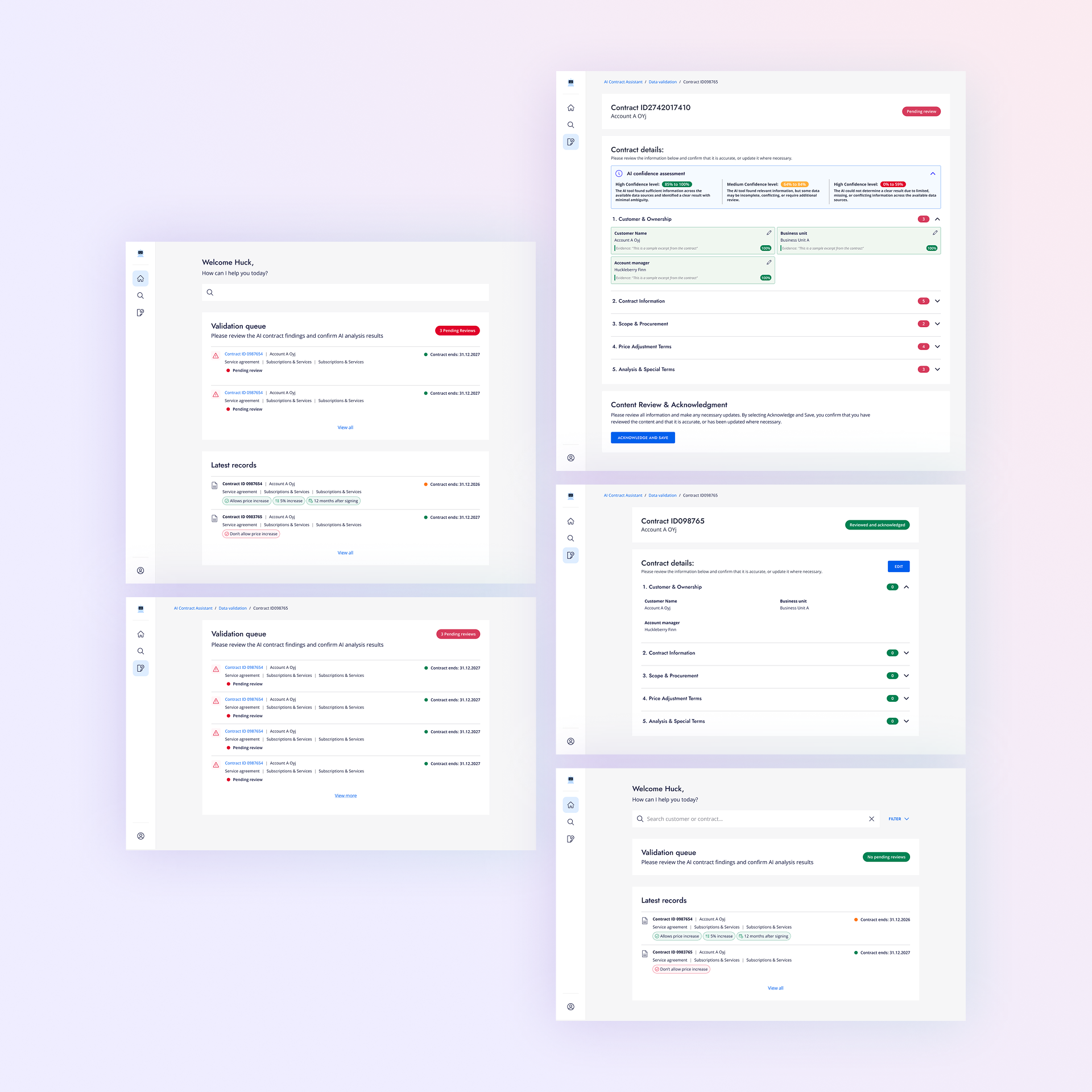
Designing trust into AI
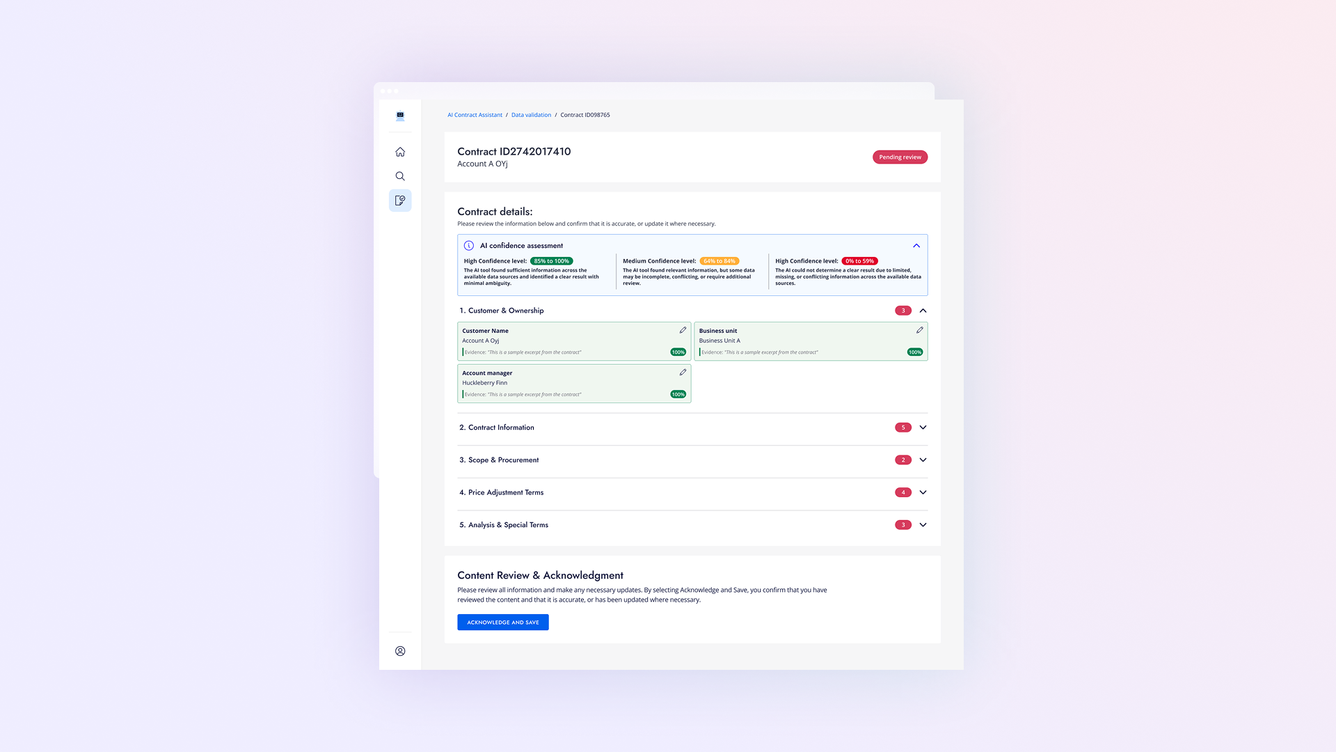
A central design principle was making the AI’s output easy to understand and verify, rather than asking users to blindly trust an answer. The interface gives Account Managers three clear signals before they make a decision:
Confidence
Visual tags and color-coded input fields show how certain the model is about an extraction, helping users quickly identify which values need extra attention.
Evidence
Every extracted finding displays the exact excerpt copied directly from the original contract, giving users immediate context without needing to hunt through legal documents.
Validation
Clear status indicators (Pending Review, Verified, Edited) show whether a human has checked the data, preventing team members from repeating work.
Whats next
Working with AI logic & edge cases
Building screens for document extractions meant partnering closely with developers to plan for unpredictable outputs and tricky edge cases:
Design System Adaptation & Handoff : Adapted the company’s existing design system to create new AI-specific patterns (like confidence badges and evidence blocks). Built these out in Figma with complete interactive states (Default, Loading, Pending Review, Verified) so developers had explicit guidelines for building the front end.
Setting Confidence Levels: Worked with developers to turn raw accuracy scores into clear Green, Yellow, and Red badges so users immediately understand how trustworthy a piece of data is.
Planning for Errors & Edge Cases: Designed clear screens for tricky situations (like blurry scans, missing clauses, or broken files) making sure users always have a clear path forward when the tool runs into issues.

Drafted by AI.
Owned by the designer.
Parsel was never designed to sound fluent.
Every translation is marked as a draft, every uncertain word is flagged, and nothing is presented as final until a person says so.
~70% Time Savings:
Saved an estimated ~12 hours per Account Manager for every price increase campaign.*
100% Reliable Data
Built a review process where every extracted number and clause points back to the original text snippet, making checks fast and accurate before decisions are finalized.
Reusable AI Patterns
Created a flexible library of status badges, confidence tags, and text snippets that can be reused across future internal tools.
The Result & Impact
What began as a personal frustration with untranslatable Figma files became a fully working AI decoding engine, a considered interaction model for handling uncertainty, and a visual identity built and rebuilt through real design iteration.
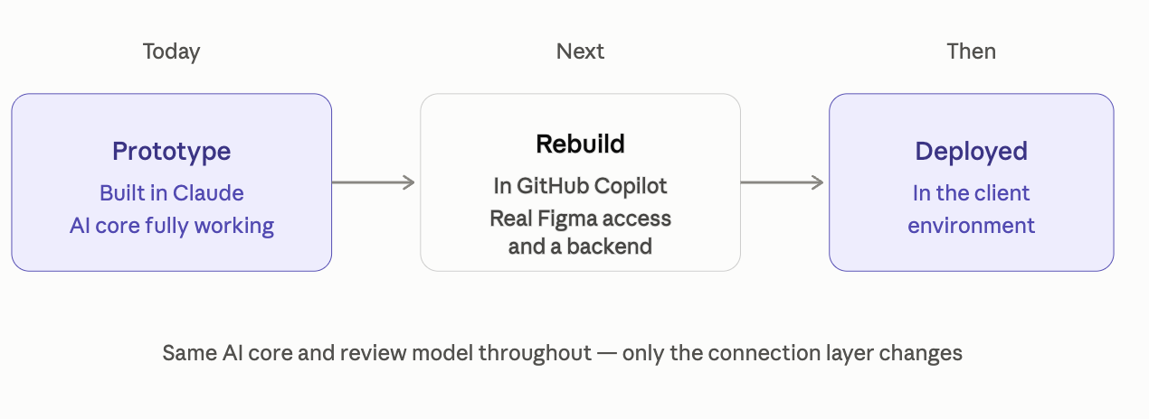
Real, Working AI Core Every decode is a live call to Claude's multimodal reasoning, not a mockup. The tool reads real screenshots, extracts real text, and returns structured, typed, confidence-scored translations today.
Design Iteration at Speed Refined across dozens of rounds — from a screenshot-only concept to a Figma-integrated tool, through two full visual identities — each iteration tested, screenshotted, and verified before moving forward.
A Clear Path to Production Every "not yet connected" moment in the prototype maps to a real, scoped next step: Figma OAuth or a personal access token, a lightweight backend, and the same AI core already working today.
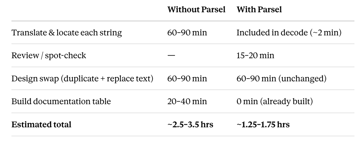
An Estimated Day of Work, Back No usability testing has been run on Parsel yet — this is a personal estimate, not measured data, based on my own typical workflow. Shown here with its assumptions, not as a hard number.
Before Parsel, understanding and documenting a complex screen (roughly 40 strings) meant opening the live file, translating string by string in place, cross-checking each one against its location on screen, then building a separate table from scratch to send to copywriting — realistically 2.5–3.5 hours.
With Parsel: paste the frame, scan the review table and spot-check anything flagged (~15–20 min), do the same manual design swap as before since Parsel doesn't touch Figma directly (~1–1.5 hrs), then copy the same table straight to copywriting — no separate documentation step.
Across an 8–10 screen flow, that gap compounds to roughly a full extra working day — time that moves from manual translation and documentation into actual design and review.
*Illustrative estimate based on ~70 accounts and ~10 minutes of manual contract review per account.
Next project
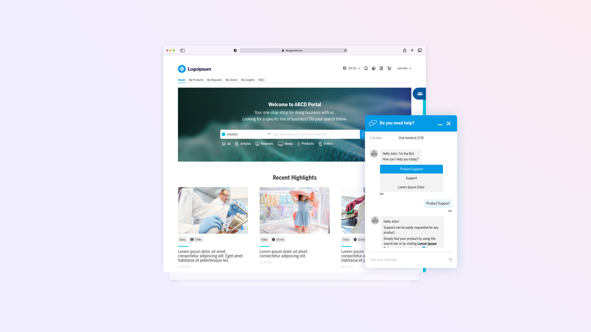
From legacy to Lightning, reimagining the enterprise experience.
Redesigning a complex B2B platform from Salesforce Classic to Lightning, with new search and chatbot experiences that simplify how users find information and get support.